Red Sox City Connect color looks off
-
When I’ve seen pictures of the new City Connect they look green and yellow. I just saw the ones you earn in conquest and they almost look grey. I like the green more.
-
Could be there's not much contrast with the aqua diamond background.

And the green isn't as stark as you think it is. It's supposed to be the faded green of the Monster.

Overall, better than the Marathon City Connects, but still not great.
-
I see what you are saying, I think its the contrast but I'm not sure. However I definitely think the marathon ones are better.
-
@SaveFarris_PSN good point. It might be the contrast. I’m not gonna lie I like the yellow and blue Marathon jerseys. I know most people don’t but I did.
-
@SaveFarris_PSN Crochet's patches are on the opposite sleeve compared to the other two guys and looks like SDS went with the patch placement of Crochet over the other two guys.
-
MLB puts the ad patch on the most visible arm depending on the player's handedness. Right Handed pitchers/hitters wear the ad on their left. Left handed pitchers/hitters wear the ad on the right.
-
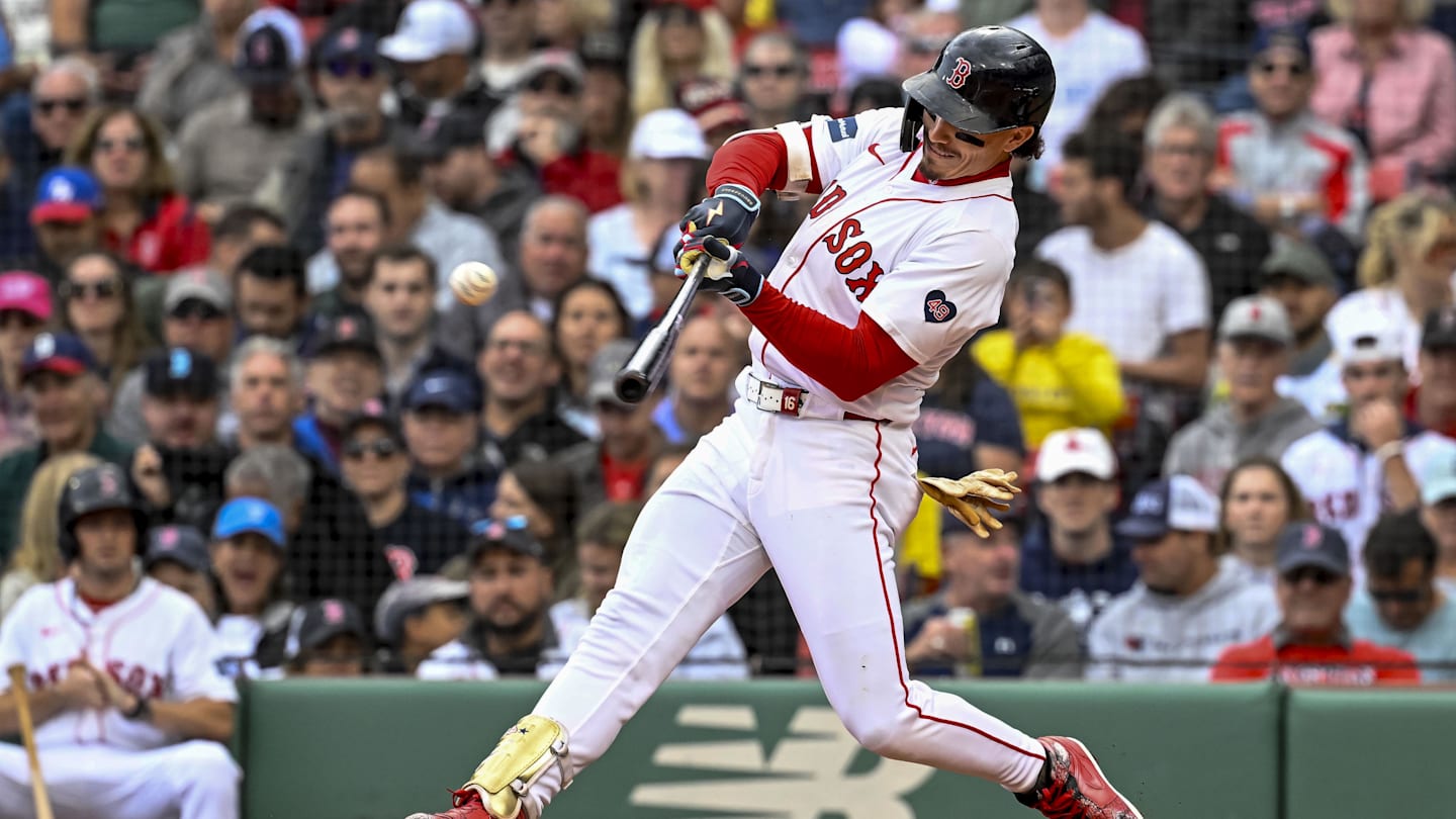
@SaveFarris_PSN Ok...but isn't that Jarren Duran? Or do I just not know this guy. Cause if its Durran he's also a Lefty.
-
Duran is a lefty. Which is why he's wearing the AD on his right sleeve. The team patch is on the left.
-
@SaveFarris_PSN said in Red Sox City Connect color looks off:
Could be there's not much contrast with the aqua diamond background.
And the green isn't as stark as you think it is. It's supposed to be the faded green of the Monster.
Overall, better than the Marathon City Connects, but still not great.
I personally love the yellow Boston Marathon City Connects.
I'm a fairly old Red Sox fan and I still like them.
I had heard bad things about the new Green Monster ones, but they're not too awful either. I like change.
-
I played a casual against my son using the new CC. They actually look really good in game.